SUPERMOMMY
Yesterday Sandy got her blog off to a great start. Supermommy she is. However, in my zeal to help her, I was embroiled in a controversy to which I have found no good conclusion:
"SUPERMOMMY" looks improper in most typefaces.
There are just too damn many M's in it.
Being who I am, an anal-retentive typeface selector, I searched high and low for a font good enough for SuperMommy. First, Sandy wanted a shield to replace the S. Then she wanted a typeface that looked kinda like the Superman title logo shown here:
I kinda thought I could do something like that for her, but I couldn't figure it out. (We'll, I COULD, but the crux of the problem is the length of the name, not how to apply the 3D effect.)
So I went online to one of my favorite font websites, www.myfonts.com. There you can search for thousands of fonts and see your text in a particular font, and then cut and paste it into your application.It's like getting a font for free, kinda. You just get a picture of it.
So I started trying to create a logo for her. So far this is some of the crap I have come up with: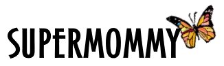
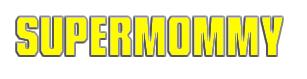
I'm not completely happy with either of them. Regardless, Sandy is a Super Mommy, and a Super Wife. And a Super Writer. And this morning, because she couldn't sleep, she was super tired.
And this post is super done.
1 comments:
I like the butterfly one!
Post a Comment